Rebuilding the site for v2
What broke about the old design once I went solo, and the decisions behind the new one.
After going solo in February, the site needed to change.
The old version was built when I was CTO at ZESTLY. It had one purpose: put my name and the companies I had shipped products for in front of anyone who searched for me.
It was fine for that. When I started consulting independently, it was not.
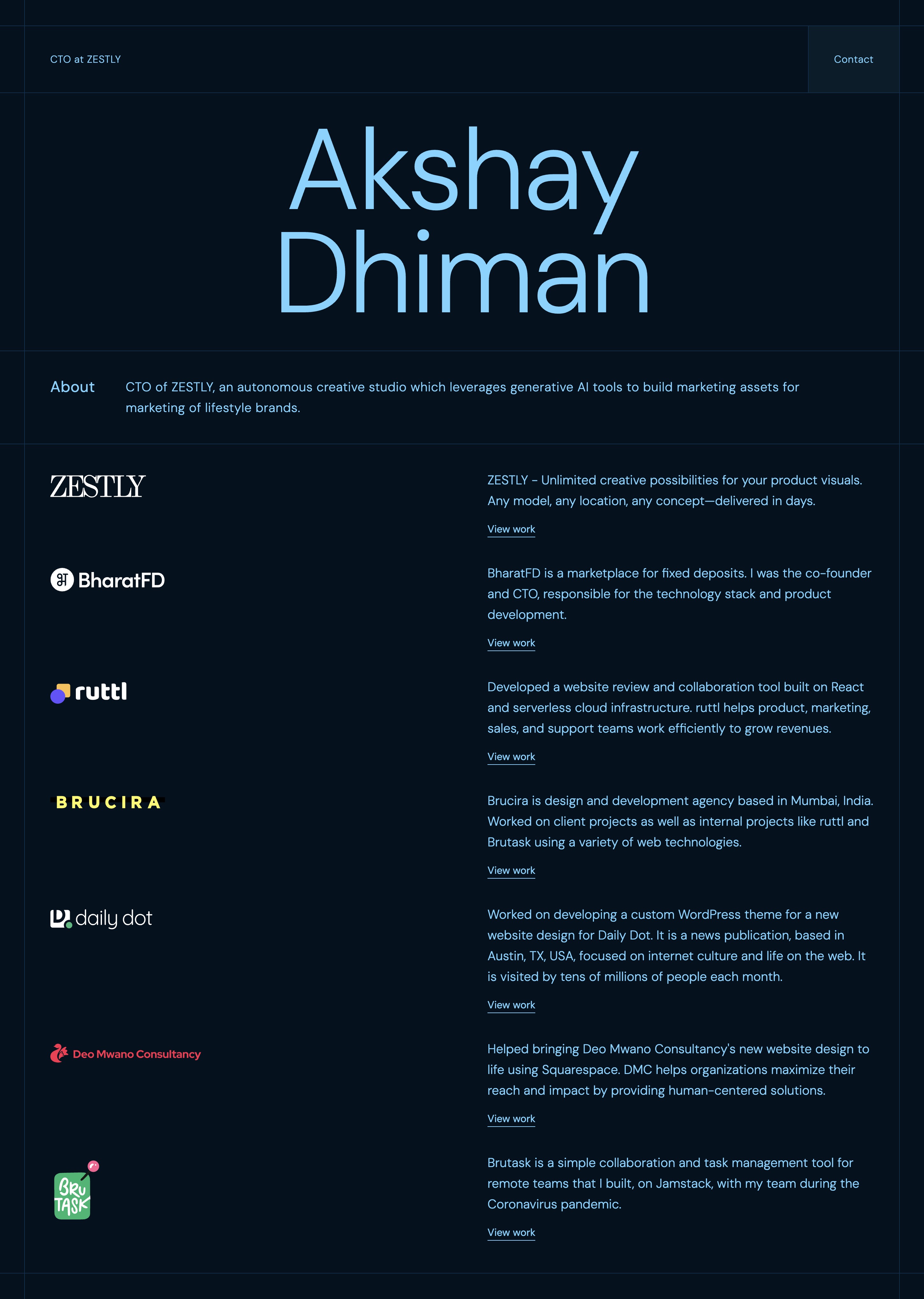
The problem with v1
The old design was a single page. Name in large type at the top, a scrollable list of company logos and short descriptions below, one button in the nav labelled Contact. That was the whole site.
There was no way to explain what I actually do, what an engagement looks like, or who I work with. No story behind the timeline. Nowhere to write about what I am building or thinking through.
The design itself was also dated. Dark navy with oversized display text and a logo grid made sense as a personal business card. It did not make sense as a site I wanted potential collaborators to spend time on.
Something had to change on both fronts.
What is new
The site now has five pages: Home, About, Services, Work, and Blog.
Home is still the entry point. But it has a proper hero with a headshot, a short description of how I work, a rotating list of what I have shipped and led, and a tech stack section.
About covers the career timeline properly. Eight years, five companies, two CTO roles, and what led me into independent consulting in early 2026. A few stats on shipped work.
Services uses a tab layout for three offerings: MVP Sprint, Fractional CTO Advisory, and Custom AI Tool Building. Each one has a scope breakdown and a clear description of who it is for. The old site had none of this — anyone trying to hire me had no idea what the actual model was.
Work shows the companies I have shipped products for, with individual detail pages for each. Blog is markdown-based with posts sorted by date. This post is the first one that is specifically about the site itself rather than product or consulting work.
The stack
I chose Astro because most of this site is static content. Astro builds pages as plain HTML with no JavaScript by default. That keeps things fast and the bundle small. The islands architecture means React only ships where something actually needs to be interactive — the animations, the services tab switcher, a few hover components.
For the interactive parts, I used:
- Motion for scroll-triggered text reveals, fade-ins, and entrance animations
- Lenis for smooth scrolling
- shadcn and Base UI for headless UI primitives — accessible components without forcing a visual opinion
- Tailwind v4 for styling
I considered Next.js. It would have been the easier default given I use it for most client projects. But for a site this content-heavy with no server-side logic, the overhead is not worth it. Astro gives the same result with less configuration.
Deployed on Cloudflare Pages. Static output works with Astro without extra setup, it is fast globally, and the free tier is fine for a personal site.
Why this took longer than it should have
The design took a few rounds. I had a clearer picture of what was missing from v1 than what I wanted v2 to look like. The dark background stayed because I like it, but everything else — type scale, layout structure, component choices — went through several iterations before something felt right.
The blog section also sat half-finished for longer than I planned. I knew I wanted a place to write, but starting is always slower than continuing.
The site is live now. I will keep iterating on it.